5. Setting the tone
The colour palette chosen for an interface sets the tone - how it makes you feel. If you get it wrong, then the user may not be comfortable with the interface.
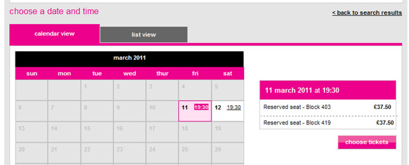
Choosing vivid, loud colours implies an informal interface e.g. buying tickets on a music festival site
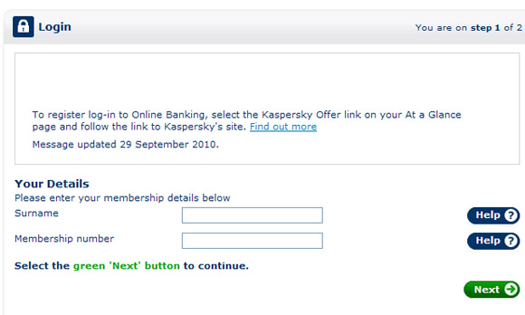
whilst paler or darker colours imply a more serious interface e.g. an application form on an online bank
challenge see if you can find out one extra fact on this topic that we haven't already told you
Click on this link: Laying out an interface